
Berry NSW
rebrand. logo. visual identity. brand guidelines.
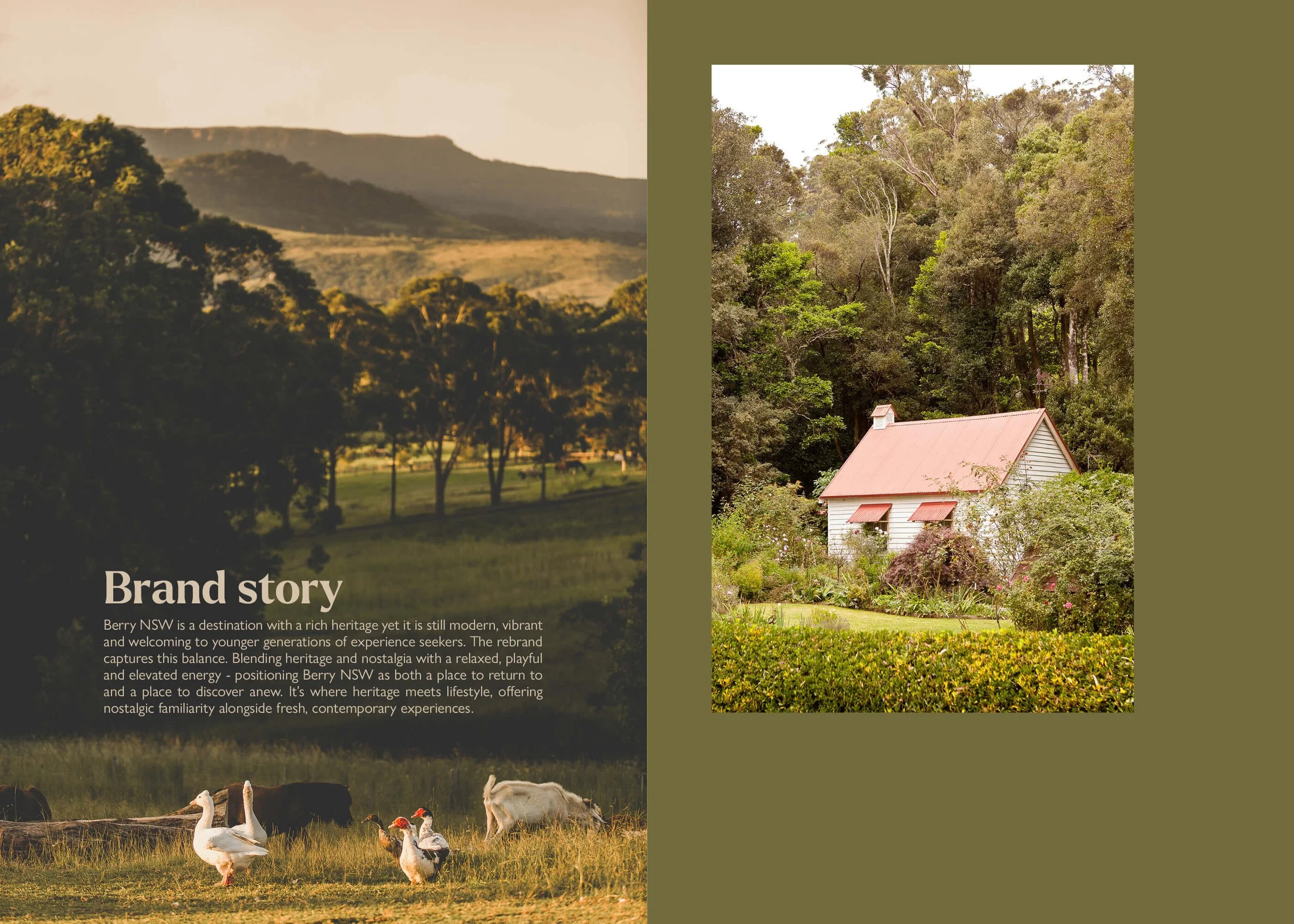
The rebrand of the New South Wales village Berry, needed to honour the town’s heritage while creating a stronger connection with contemporary audiences. Rather than pursuing a dramatic reinvention, the approach was evolutionary — building on existing brand equity and local sentiment while introducing a renewed sense of energy, personality and relevance.
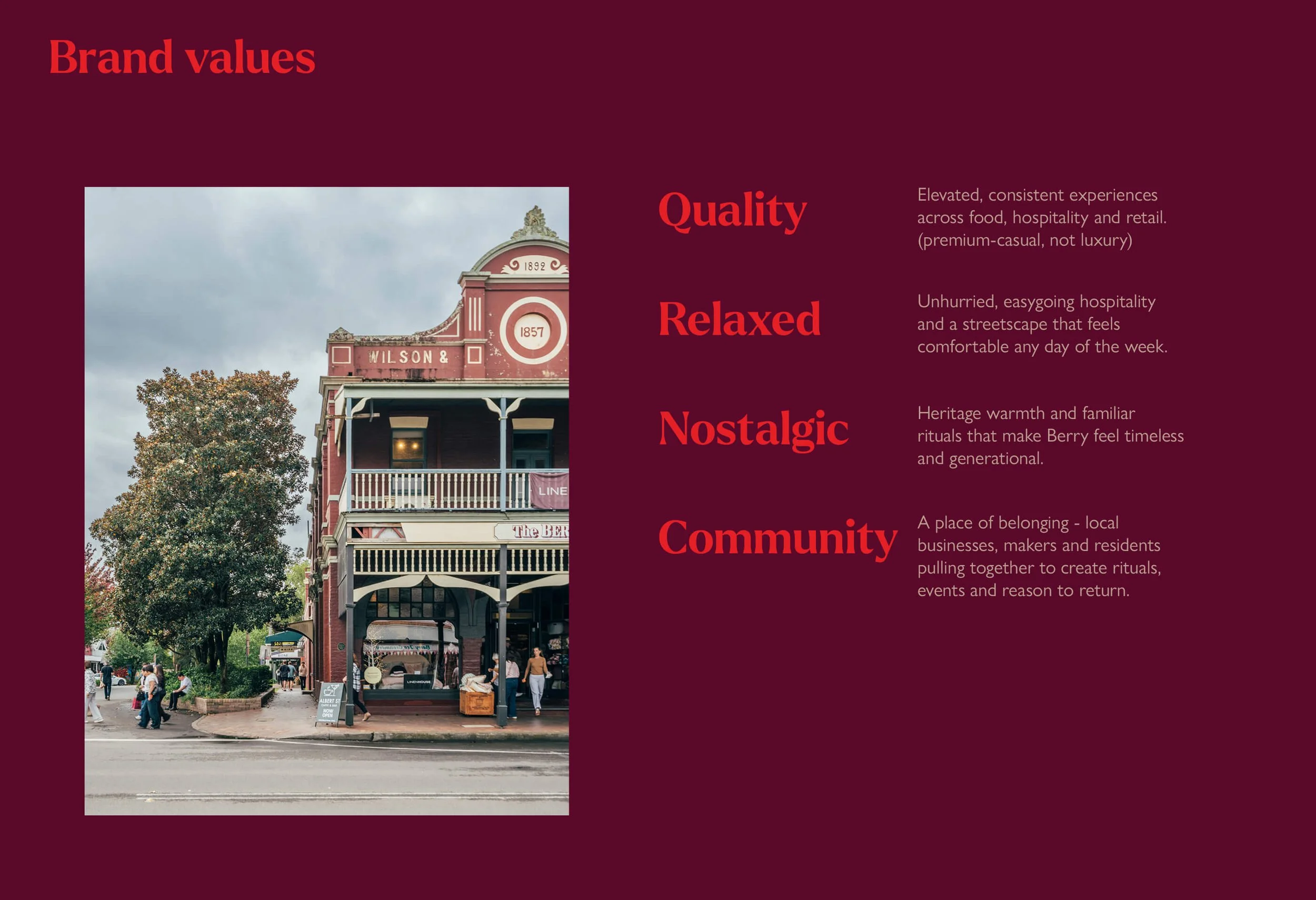
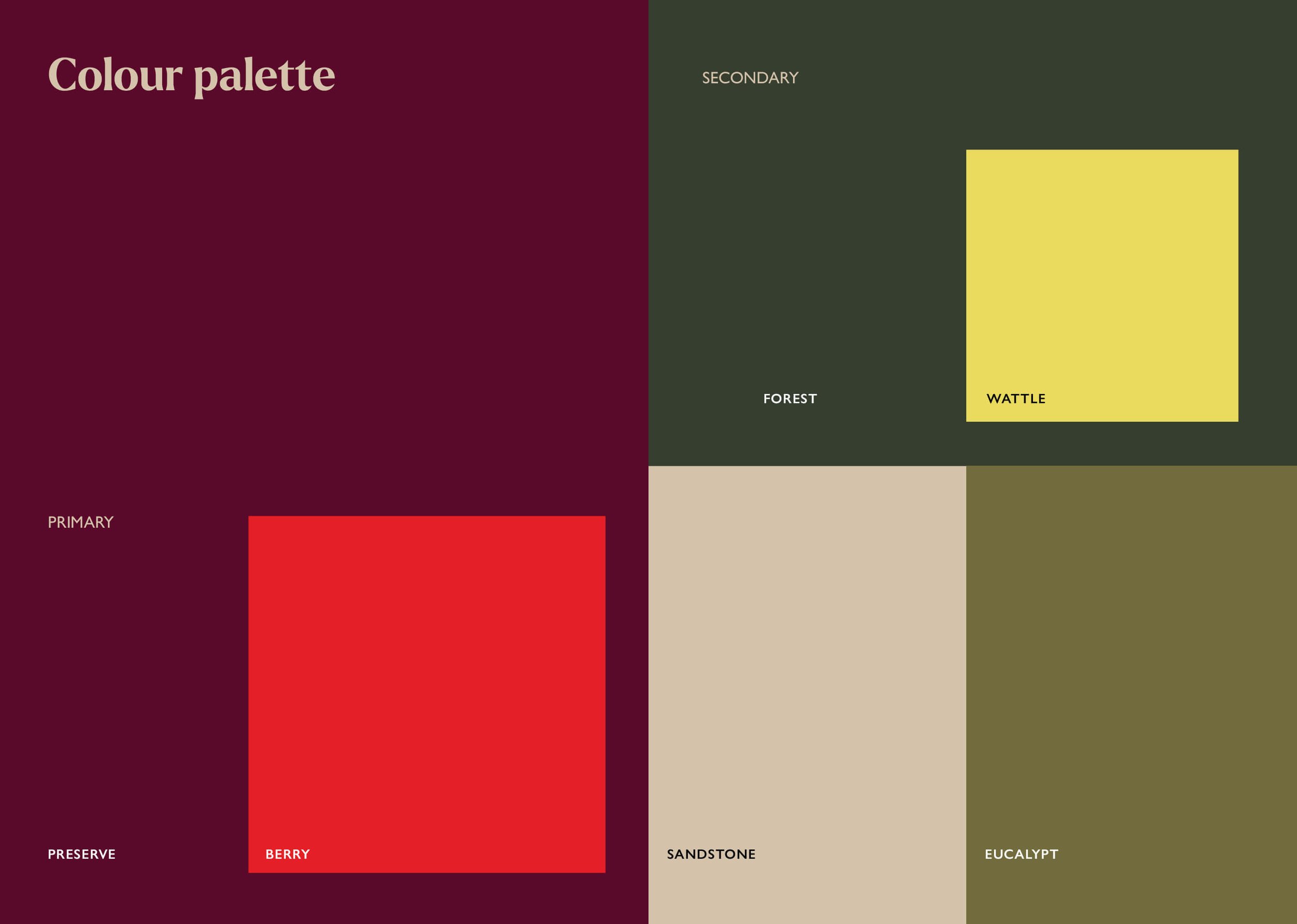
The creative strategy was to balance tradition and modernity throughout the visual identity. A colour palette inspired by Berry’s heritage architecture and landscape — featuring burgundy and deep greens — is paired with modern neon-like accent colours, bringing energy, warmth and a modern lifestyle feel. Similarly, the typography combines a refined serif logotype that nods to Berry’s heritage and premium positioning, while its contemporary, relaxed execution conveys style and approachability. Subtle playful details within the letterforms add personality and friendliness. Supporting this is a secondary typeface with an imperfect, hand-drawn quality, used at varying scales to create a sense of friendliness, approachability and runpolished charm, balancing the sophistication of the primary logo.
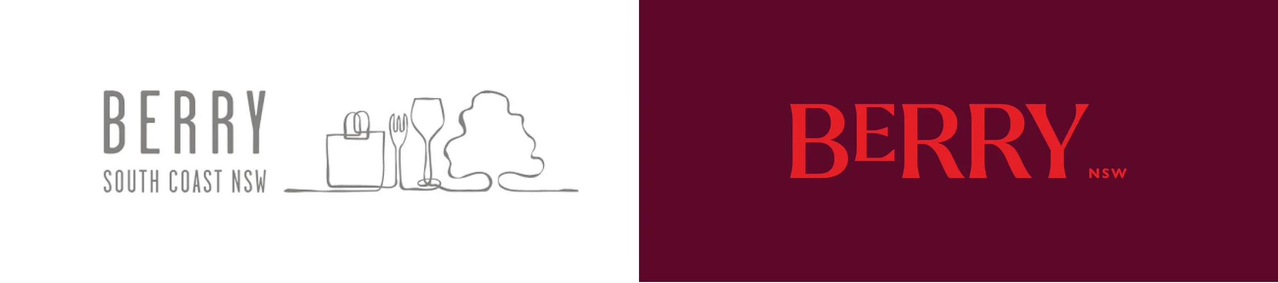
Before
Historically positioned as a luxury heritage town with an older demographic, Berry was known for its tree-lined streets, antiques, boutique shopping, and food and beverage culture. It was once synonymous with five-star dining and luxury accommodation, attracting visitors seeking a premium country escape.
After
Today, Berry is about contemporary village life: a charming mix of heritage, urban comforts and community energy. The rebrand aims to evolve Berry from being seen as a heritage town for older demographics into a destination for younger visitors, families and experience seekers, while still retaining its nostalgic, generational appeal as a place people return to year after year. It seeks to shift perceptions of Berry from luxury to premium yet accessible, while fostering greater year-round vitality so its streets, businesses and community remain vibrant beyond weekends and holiday peaks.

Logo animation
Logo on images
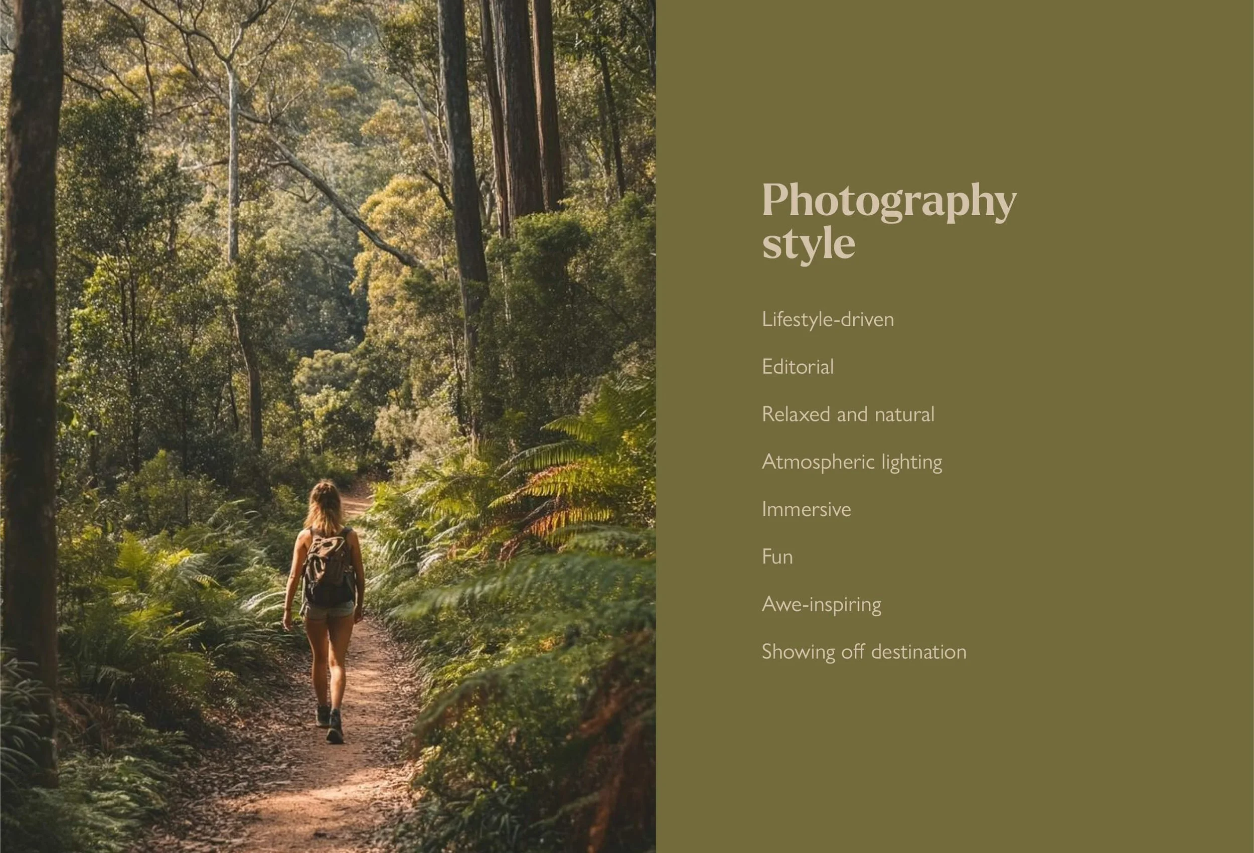
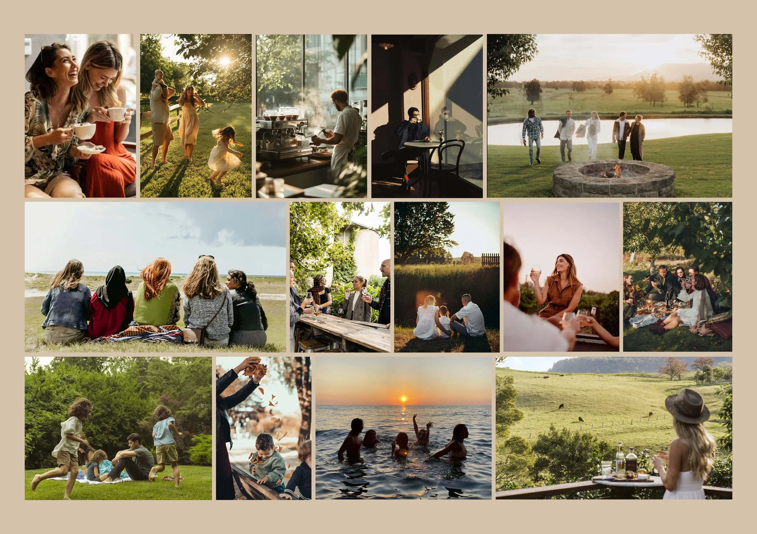
Brand messaging
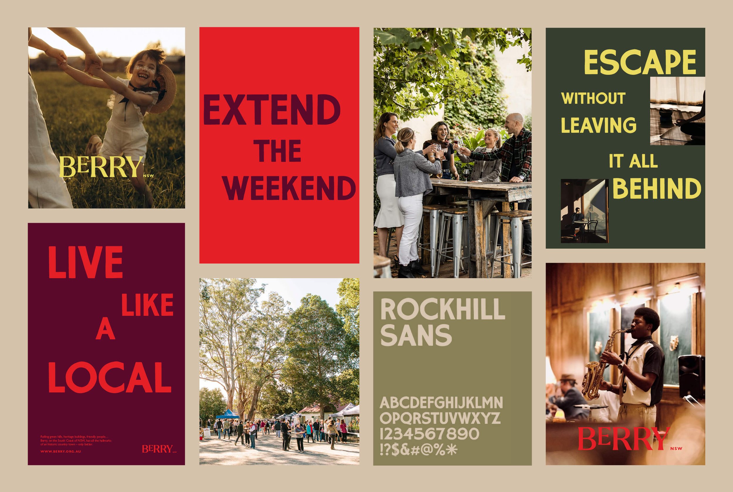
Visual identity overview
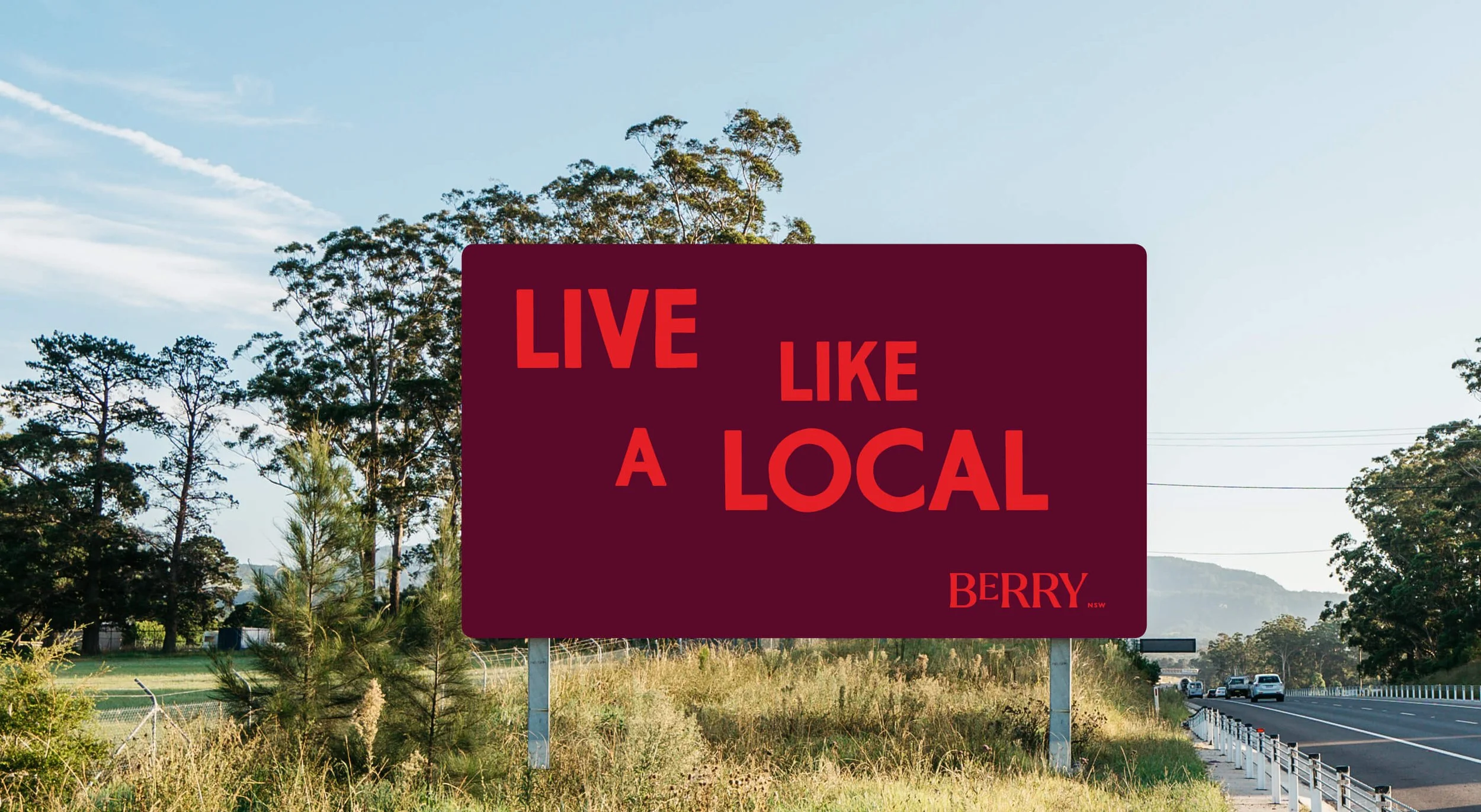
Highway sign
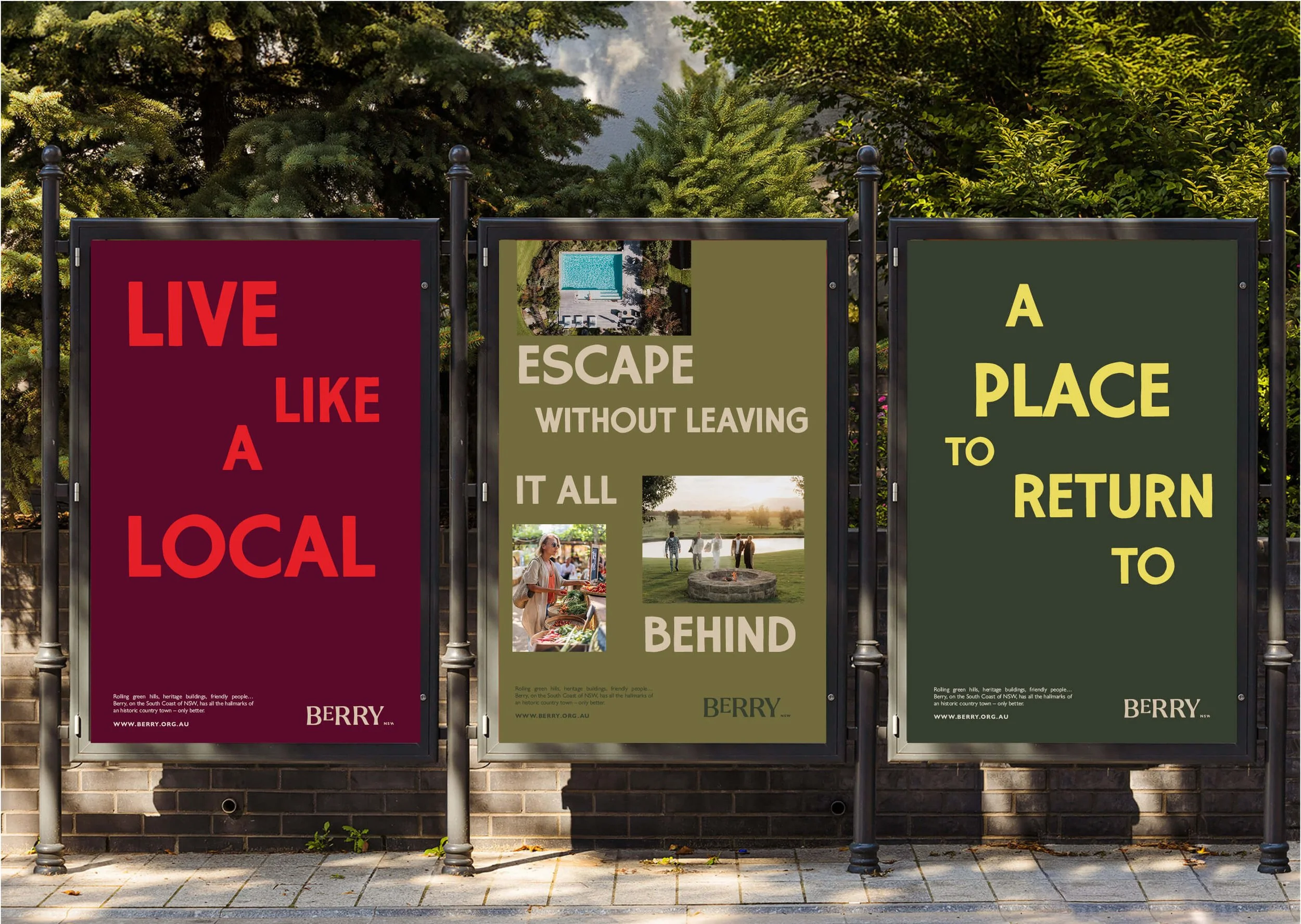
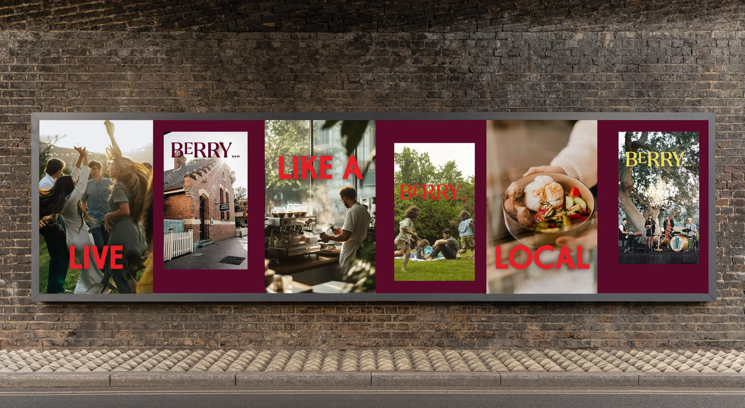
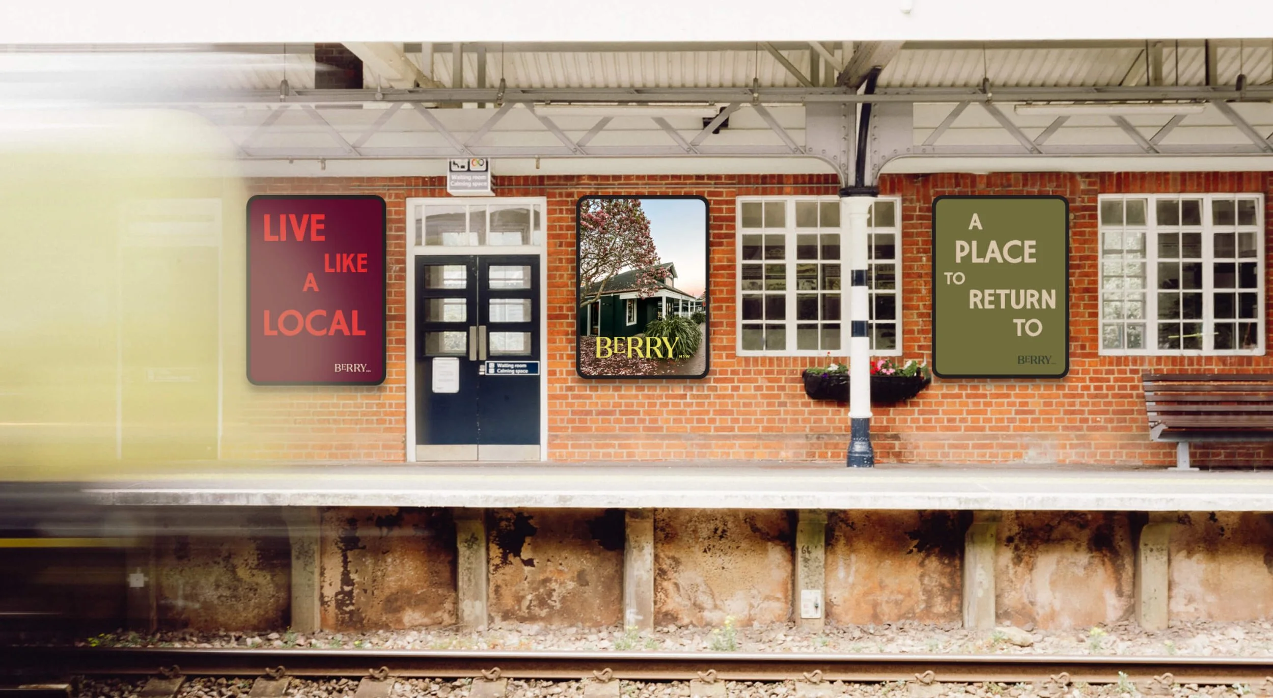
Posters
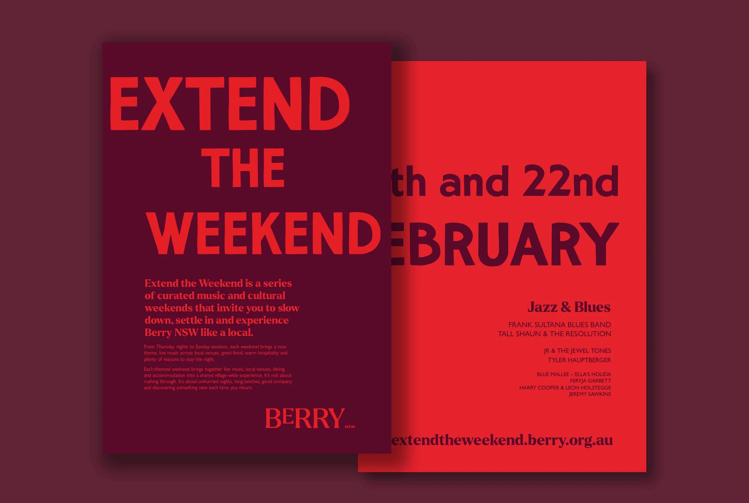
Flyer
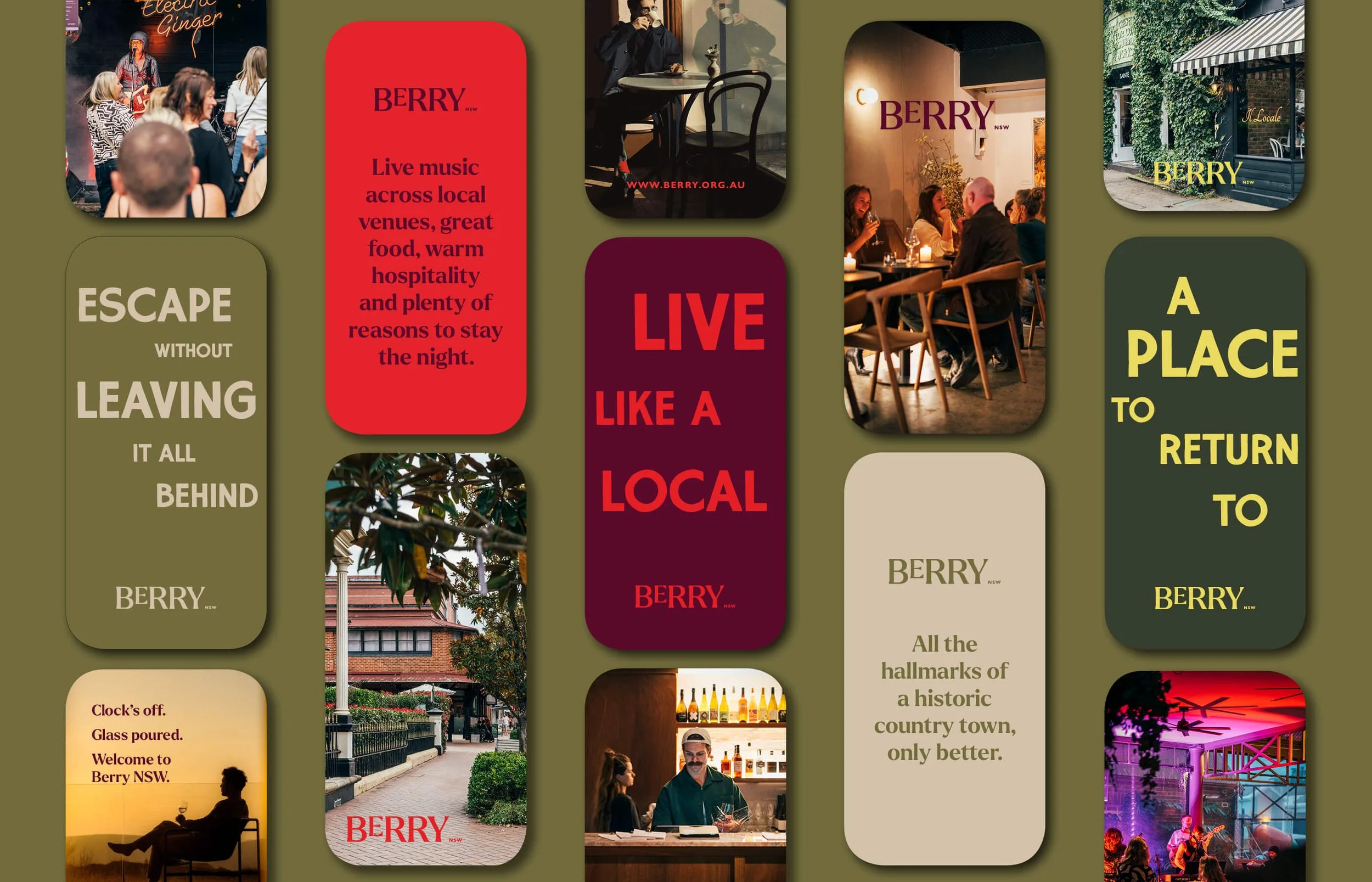
Social media posts
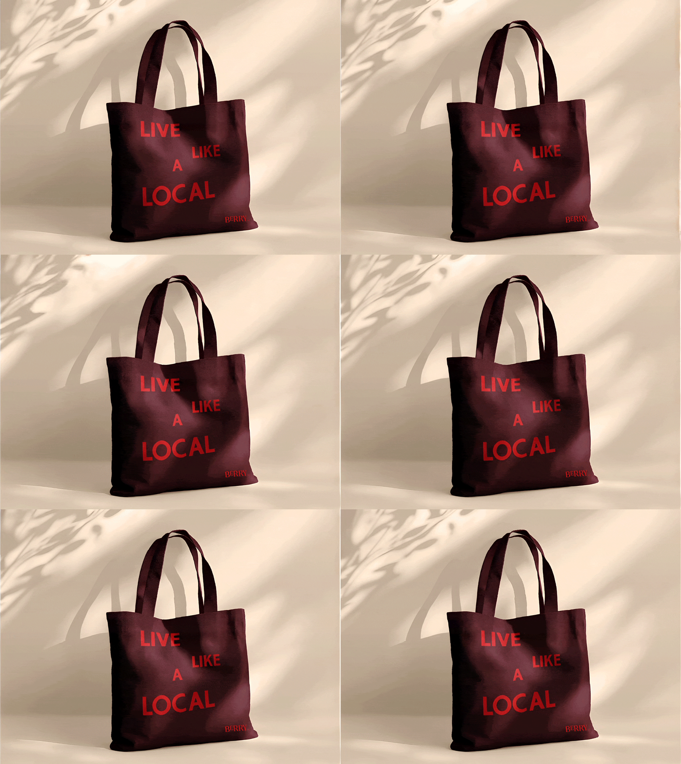
Merchandise
Extend the Weekend Campaign
A sub-brand of Berry, the Extend the Weekend campaign is a series of curated music and cultural weekends to experience Berry NSW like a local.
The creative direction for this aligns closely with the core Berry brand, ensuring the two identities feel clearly connected. The same fonts and overall layout structure are used to maintain consistency across both.However a different colour palette has been introduced. This palette draws on warm, festival-inspired tones while still working within a defined base and highlight colour system. A dedicated ETW logo has also been created as part of the identity to further distinguish the campaign while remaining visually cohesive with the Berry brand.
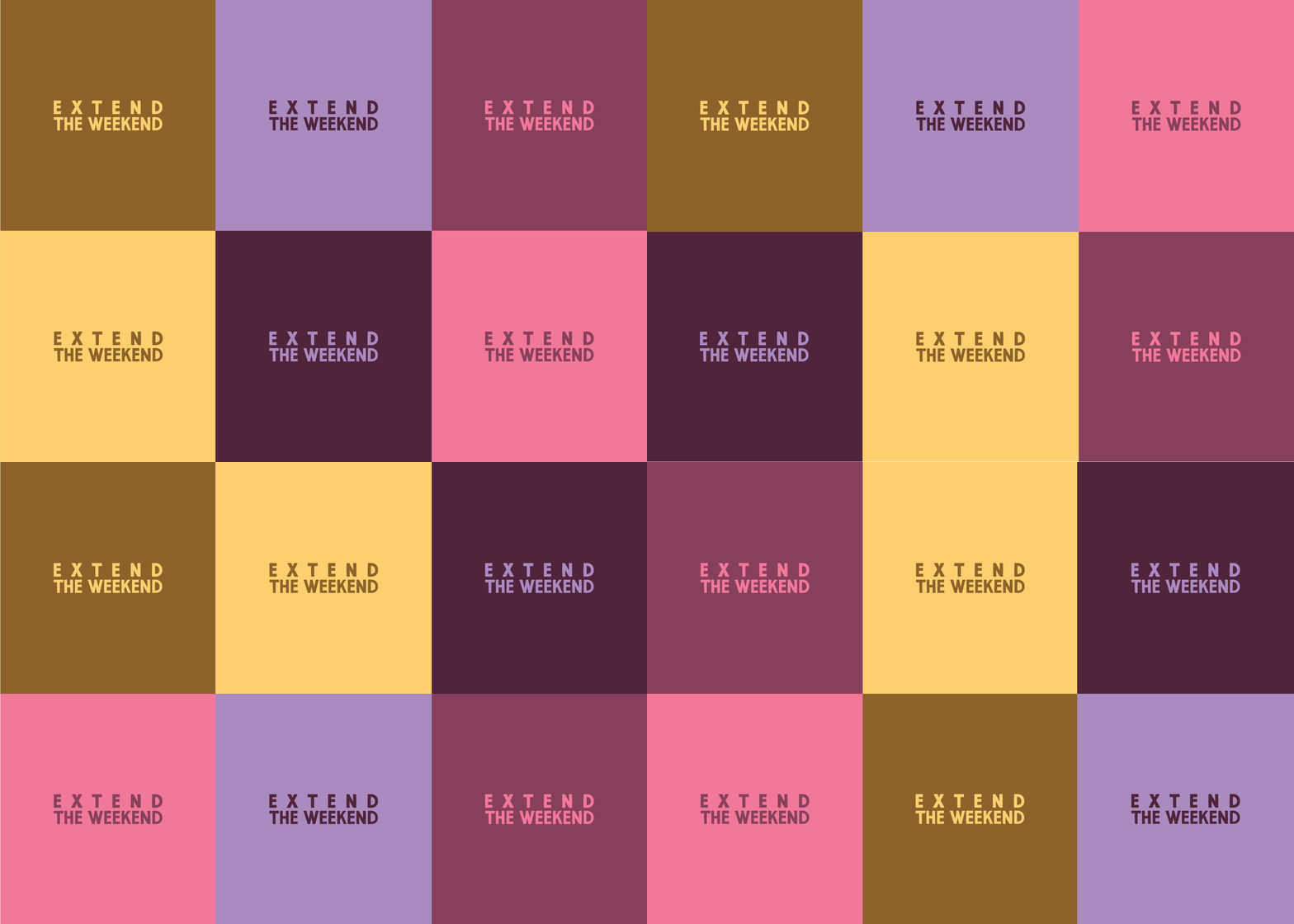
Logo and colour ways
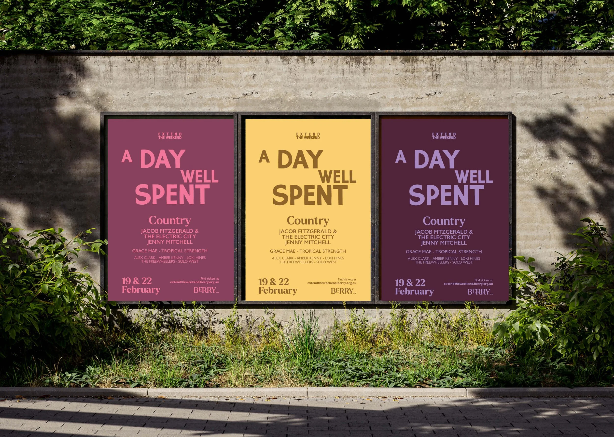
Street Posters